
Who knew that a simple font like Arial could cost you much more of your ink and toner in the printer than other fonts? Is it that hard to believe?
Look closely at how prominent Arial really is. The letters are big. The ink’s deep. Makes sense that after a few dozen pages of printing, Arial might waste that ink cartridge faster than you can say ‘Epsilon’.
Apparently it’s true, and it’s been studied widely by experts: statistically you lose over 20% more of your ink by using this font you’re seeing right here, and the sad thing is Arial’s a standard in today’s content industry.
So what do you do? What can you do?
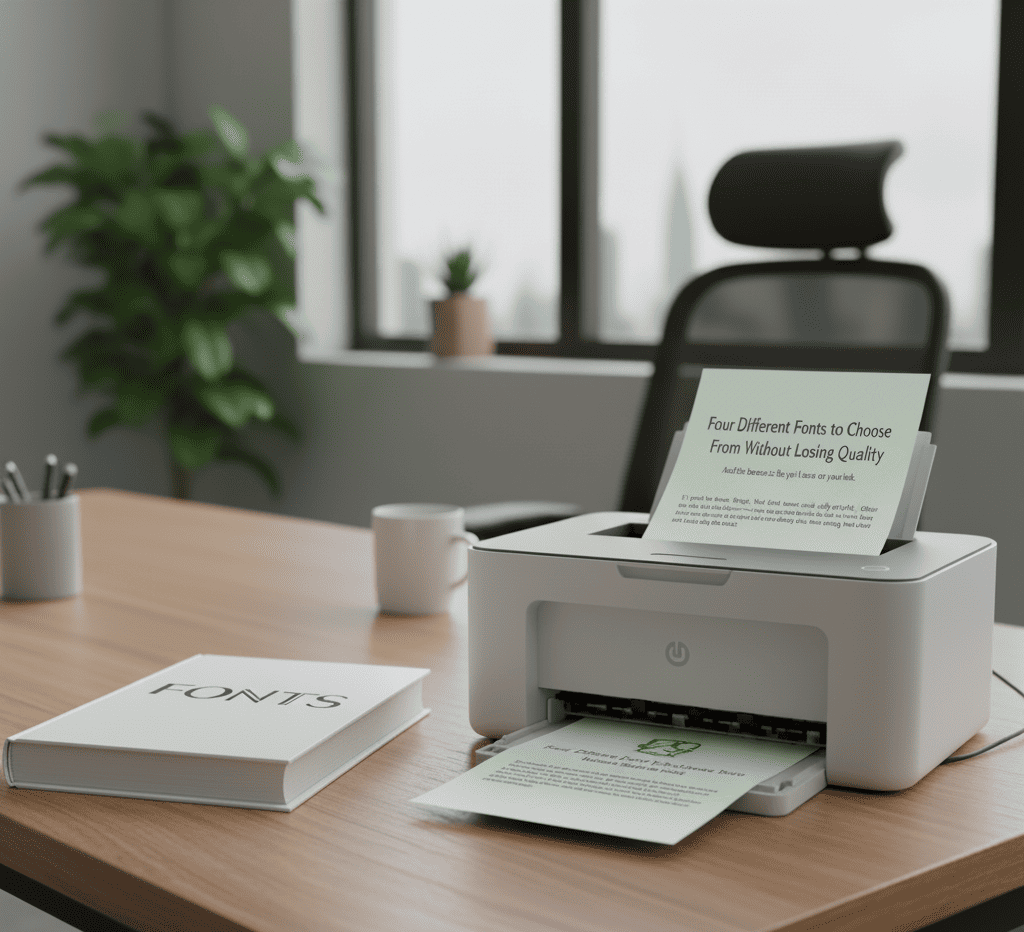
Four Different Fonts to Choose From Without Losing Quality
And the bonus is this: you’ll save on your ink.
It’s good to know, though, that Arial isn’t the only culprit. Other fonts waste ink as well, but one thing’s for sure – we have four different fonts you’ll probably love, as well as your printer and your pocketbook will love, and this first one is the one you’re seeing right here while reading this article: Times New Roman.
You see? Information truly is power, as no one ever would’ve thought a simple change from Arial to Times would make a difference. It does. Times New Roman outdoes Arial by 27%, apparently.
It seems like pennies and dimes to the budget, but in all honesty – do you really want to ignore the facts?
The ink and toner industry’s booming with a lot of competition to boot. Prices may go up. Ink’s a hot commodity.
You want to save as much money as possible in your company funds, keeping your cartridges running smoothly as you print out the next whitepaper or memo for your office, but let’s just say you’re not a fan of Times New Roman. What do you do then?
Well, the Good News Is You Can Also Switch to Calibri
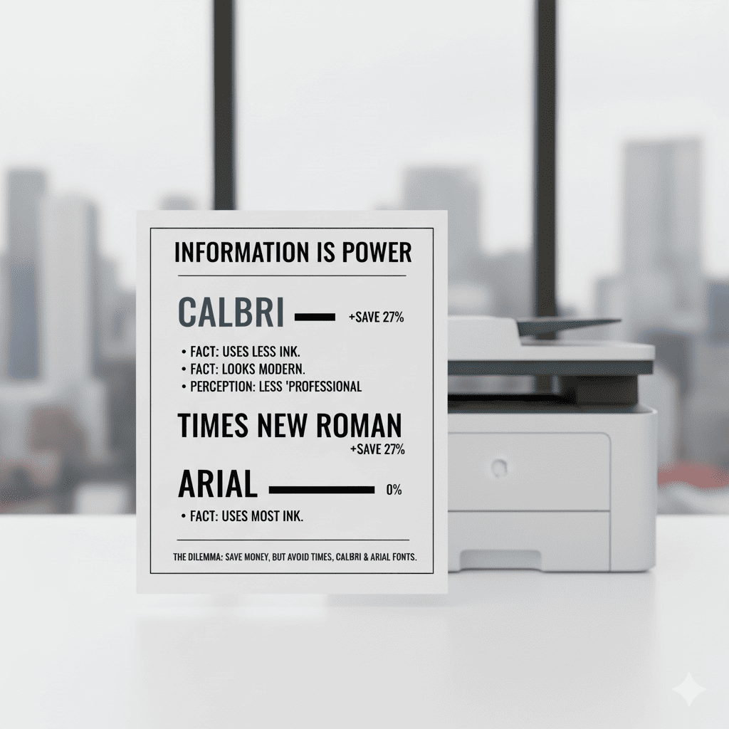
How about this font? Is this more your style? A lot of professionals use this one as well. And it turns out here’s a font that also outperforms Arial just as much.
Again, though, printers vary in terms of efficiency, so there’s no real accurate way to measure the output versus the cost except for what you’re reading here. You either go with Times or Calibri, and you’re set.
Some problems, though, people have with Calibri is the lack of ‘professionalism’, for lack of a better term. The printer ink font looks a bit childish.
That’s, of course, a matter of opinion. We’ve seen resumes printed in this font, and we never saw any problem with them whatsoever. But each to his/her own.
So you’re facing a dilemma here: you don’t want Times, and you don’t want Calibri. And you certainly don’t want Arial, because you like your company profits to continue growing the way they are.
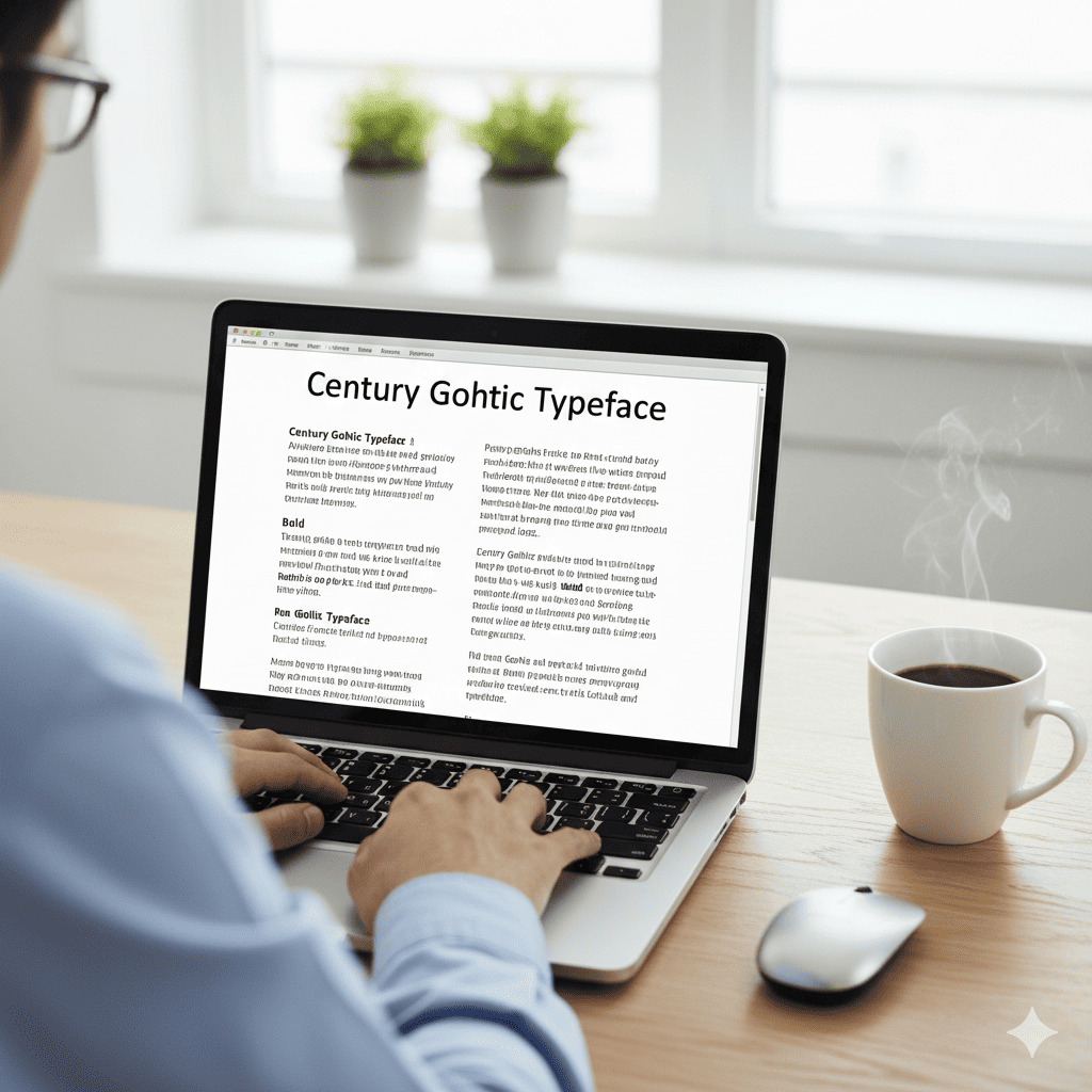
Century Gothic Also Saves Ink and Money
And just in case you print this out, freaking on the fact that we used Arial for just a bit in the intro paragraph, know this: it all adds up, and we can sweat the slight use of the expensive font given that over time and lots and lots of printing, costs for toner can get as high as $100K. That’s a lot.
But as we’ve mentioned – Century Gothic, what you’re looking at right now, is also a suitable replacement. We’re talking about a 30% decrease in printing ink versus Arial.
A decent change as well, however as you notice these words are a bit bigger, albeit a thinner print line accounting for the decrease in ink usage.
Century Gothic’s not for everyone. After all, if you want to jam in as much quality content on a page but start seeing the paper count add up due to the extra space, the decreased cost in ink might get balanced off by the fact that you’re using more of your stationary.
It all depends on your needs, really. Printing a novel? Century Gothic’s probably not what you want…. But you might like this last font choice:
Ecofont

Utterly revolutionary when it comes to printer ink fonts, because here’s the thing about this style – you can’t tell you’re using it! That’s why you’re seeing Times right now as the go-to, but just in case you’re curious as to what the difference is, here’s a shot for a comparison:
What you’re seeing is Vera Sans in regular font at the top. At the bottom is what Ecofont would look like up close.
Yes, it’s true: you can get Ecofont in the Sans style, Garamond, some other styles, and even Arial. You can see what the key is: those little holes you see in the letters cut down on the ink usage tremendously, so it might be worth a look.
What you have to understand, though, is that this is a very specialized font style. You can get it for an additional $19.95 to install in your Word processor and Outlook, but in the long run, the investment might be worth it in terms of the ROI. Might be something you’d want to look into….
In the End, It All Depends on Your Preferences
Do you print very little and still like Arial? Fine. Stick with it. Arial’s okay. And the cost on your printer ink will be minimal (just keep maintaining that printer if you’re not using it much).
But if your printer usage does go up a fair amount, you might want to consider Times, Calibri or Century Gothic. Choices, choices, choices.
Still, if you’re regularly using that printer – like, every day, every hour – spending that additional $20 for the Ecofont in the long run may be the very best bet.
You’ll be thanking your decision, as you can get this form in just about any font you fancy.
So, again, consider your options. Because you can’t afford not to, especially if you’ve already printed out this 1K-word whitepaper about saving ink. Ironic.
Frequently Asked Questions
What are the top 4 fonts recommended for saving printer ink?
The top four fonts recommended for saving printer ink are Times New Roman, Calibri, Century Gothic, and Arial (as a font to avoid). Switching from ink-heavy fonts like Arial to these alternatives can reduce ink usage by over 20%, saving money on toner cartridges. For additional savings on office supplies, consider selling unused toner or purchasing affordable cartridges through TonerConnect.
Why do some fonts use less ink than others when printing?
Some fonts use less ink because of their design, such as thinner strokes and less surface area coverage on the page. For example, switching from Arial to Times New Roman can reduce ink usage by over 20% due to these differences in letter density and spacing. To further save on printing costs, consider TonerConnect for selling unused toner cartridges or purchasing affordable replacements.
Can I change the default font in my word processor to one that saves ink?
Yes, you can change the default font in most word processors to an ink-saving option like Times New Roman, Calibri, or Century Gothic. Switching to these fonts can reduce printer ink usage by over 20%, helping you save on toner costs. For additional savings on office supplies, consider selling unused toner cartridges through TonerConnect.
Do these ink-saving fonts affect the readability or professionalism of my documents?
No, using ink-saving fonts like Times New Roman, Calibri, or Century Gothic does not compromise readability or professionalism; these fonts are widely accepted in professional and academic settings. In fact, Times New Roman is a standard serif font known for its legibility in printed documents. For additional savings on office supplies, you can sell unused toner cartridges through TonerConnect to offset costs.
Are there any other printer settings I should adjust along with using these fonts to maximize ink savings?
Yes, adjusting printer settings can further maximize ink savings. Using the “draft” or “economy” mode reduces ink usage significantly, and printing in grayscale instead of color conserves costly color cartridges. For additional savings on office supplies, consider TonerConnect to sell your unused toner cartridges or purchase affordable replacements.